
© 2026 Charles Landriault. All rights reserved
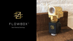
In late 2017, Flowbox brought me on as Brand Director to build a brand from nothing. The company was pre-launch — a 20-person team of investors, engineers, marketers, and designers moving fast on seed funding. The original go-to-market plan pointed toward France and the broader European market; when the CES Las Vegas opportunity opened up, priorities shifted west and the timeline compressed hard around that show, set for January 2018. There was no existing identity, no product photography, no marketing materials. A co-founding VP of Marketing appointed me directly, and I worked from the market research and positioning strategy her team had already built.
The brief was deceptively simple: make a water-valve startup look high-end and expensive. Flowbox’s founders had already committed to the product’s physical cue — a gold-painted valve paired with black hardware. They wanted the brand to carry that same jewelry-grade feel across three very different buyers: residential homeowners, commercial property managers, and industrial facilities. The stakes were real. Cheap knock-off valves were already coming out of India and China, and Flowbox’s real beneficiaries weren’t just homeowners — they were insurance companies, several of which were in talks to lower policy premiums for anyone using the valve. A brand that looked anything less than trustworthy would undercut that whole model. Underneath it all, every department was building from zero at once. Validating a design decision against engineering or sales often meant waiting on things that didn’t exist yet. I had to improvise and keep moving without becoming the bottleneck other teams were waiting on.
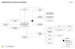
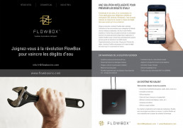
My role covered the full system: the visual identity and the status iconography that grew out of it, the UX/UI and navigation of the mobile app, the switch and remote hardware design, and every piece of go-to-market collateral — sales one-pagers, the CES booth and roll-up banners, stationery, headline copy, the logo descriptor. I also managed the external development team building the app, working closely with engineering and sales to keep everything moving together. I brought three logo directions to the team before we landed on the one we shipped, refined over a few rounds of revisions. Partway through, the first dev vendor wasn’t delivering the quality or timeline we’d agreed on, so we pushed to switch vendors rather than let the launch slip. When CES arrived, I was on the booth too, representing the brand alongside the rest of the team.
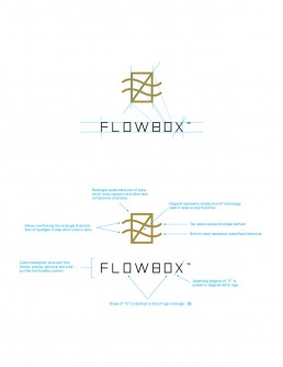
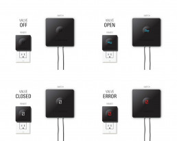
The mark carries the logic of the product itself: the rectangle echoes the valve’s housing, the diagonal reads as the shut-off mechanism, and two waves stand in for water moving through the pipe. A custom sans-serif keeps the wordmark precise and solid — the same qualities the valve needed to project. That symbolism extended into a full status iconography across the physical remote and switch (Off, Open, Closed, Error) and mirrored inside the app’s onboarding, valve registration, and dashboard screens, so the hardware and software never told two different stories. Around that core, I built the bilingual go-to-market layer — one-pagers for all three market segments, trade show signage, and the booth presence that carried Flowbox onto the CES floor.
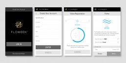
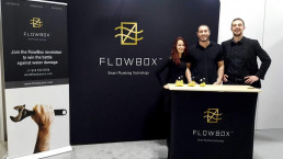
It worked. At CES, the branding stood out — leads read Flowbox as solid, professional, and serious, credible enough to keep talking business with people much bigger than a pre-launch startup. That included a real conversation with a major home-improvement retail chain in North America, and multiple positive responses from insurance partners already exploring premium discounts tied to the valve. Flowbox folded a few months later — funding pulled amid a falling-out between founders and investors, unrelated to the brand or the product itself. But the traction was real while it lasted. What stuck with me most was the latitude I was given to get there.
The team trusted my judgment enough to hand me a highlevel role and let me steer the brand by my own read of it, without routing every decision through layers of approval. That trust is what let the work move fast enough to matter.
Flowbox taught me how a startup actually runs, not how it looks from the outside. Product, marketing, and sales don’t move in a tidy sequence — they happen all at once, under funding tied to milestones and investor trust, and you fill the gaps with judgment when the input from other departments isn’t ready yet. That pressure sharpened something I still carry: the value of having real authority over my own domain. When the team trusted me to own the brand outright, I could develop the vision with more precision and follow it through with less compromise. That’s the environment I do my best work in.

Hey! If this is the kind of thinking your team needs — for a position, a project, or just a conversation — I’d love to hear from you.