
© 2026 Charles Landriault. All rights reserved

Mériance Collagène built its business on real ingredients at a premium, yet still accessible price — 100% natural, cruelty-free, made in Québec. By late 2019, some of our retail partners were already refilling gallon-size dispensers in store, and customers loved it: lower cost, less waste, real satisfaction. The demand was proven. It just lived entirely at a physical counter.
In January 2020, I was hired as head of marketing, and we started sketching what a refill line built for the brand — and for online buying — could look like.
Then Covid hit, and online buying went from a growing channel to the only channel in a matter of weeks. The in-store refill counter — exactly the ritual customers couldn’t reach anymore — needed an online equivalent, fast. At the same time, Québec’s “buy local” mood was surging as supply chains broke down elsewhere, and “Made in Québec” suddenly carried more weight than a line on the back of a jar.
Packaging was also one of the largest costs behind every Mériance product. So this wasn’t a sustainability sticker to add on top. Done right, a refill system would cut our packaging cost, keep prices accessible, and let the brand keep every promise it already made — natural, cruelty-free, made here. A real three-way win, if we could ship it before the moment passed.
Capture a brand’s actual essence with honesty, and the identity reveals itself. You don’t have to force it.
I proposed the name Intègre and the tagline “Le naturel à son meilleur,” because they matched perfectly with the strategy. Then came the full identity: visual system, packaging, photography direction, the digital campaign, and the newsletter program that carried it to launch. The product names were developed in close collaboration with the formulators, matching each cream and serum to an element based on how it actually behaved on skin. Phénix renews (fire), Ondine and Jouvence hydrate (water), Orée nourishes (earth). No air product yet.
The refill promise needed a physical answer, not just packaging copy. Production of the reusable bamboo caps and jars was sourced from, and coordinated with, a local wood shop, and I managed the packaging supplier relationship directly — the sustainability story had to hold up in a warehouse, not just on a label.
With trust from the owners and investors, the identity direction went through with minimal pushback, which let us move at the speed the moment demanded instead of the speed a committee would have allowed.
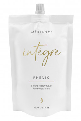
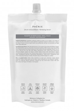
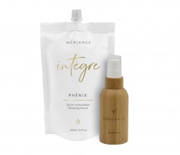
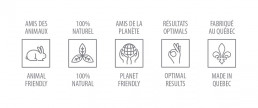
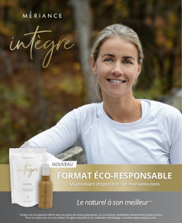
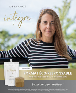
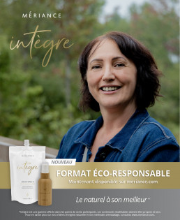
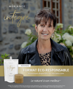
Four products, one system: Phénix, Ondine, Jouvence, and Orée, each sold as a refill pouch paired with a reusable bamboo-capped bottle or jar. Every pack carries two icon systems — five attribute marks on the back and a single element mark on the front, so the product’s promise reads at a glance.
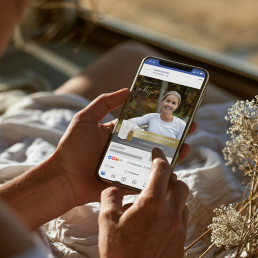
The name mattered as much as the packaging. Intègre — integrity — was the thesis for the whole campaign: real customers, no makeup, no retouching, shot as themselves. We ran an online contest for it: customers entered to win a full photoshoot, which I shot personally, using the products they already loved. It gave them a genuine cover-girl morning, and it gave the campaign faces that were entirely real. Participation was overwhelming. A brand called Intègre needed a campaign that was actually honest, not one that just said so.
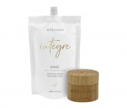
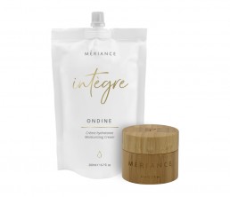
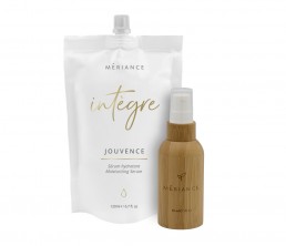
The social and digital launch, aimed squarely at Québec audiences, brought in new customers at a pace we hadn’t seen from a single campaign before. Existing customers moved to the bulk option fast — the savings were immediate and real. I don’t have hard numbers from a launch this many years back, but the response from retail partners and from the campaign itself was unambiguous: this was the rare idea where the brand, the customer, and the planet all actually won.
This project taught me how the cosmetics business actually works, end to end — product development, branding, advertising, sales, supply chain, customer service, not just the marketing layer I was hired for. Driving out to meet retail partners and customers in person, instead of relying on reports, gave me a read on the business no dashboard could. It also confirmed something about identity work itself: it doesn’t need bells and whistles. Capture a brand’s actual essence with honesty, and the identity reveals itself — you don’t have to force it.

Hey! If this is the kind of thinking your team needs — for a position, a project, or just a conversation — I’d love to hear from you.